
New users often feel overwhelmed with the features and workflow in blender, which we hope to solve with our design.
OVERVIEW
So we implemented a 3 part workflow:


FEATURE
CHALLENGE
ORIENTATION
INTERVIEWS
8 Participants (beginner users) were asked to create a doughnut:


Painpoint 1
Information overlaod
The current display of the feature lacks salience and overwhelms users.
Painpoint 3
Behavior - tutorial mismatch
Users who prefer individual explorations want referecnes that facilitates but not instruct
Painpoint 2
High platform-switching cost
Most existing tutorials are from external soruces and are often hard for users to follow through
Painpoint 4
Hotkey / feature documentations
Blender is known for its variety of hotkeys, and users find a need for a sustained documentation
Design goals
Orientation
Framework
Overview
IDEATION
Sketches for different features


LOWFI PROTOTYPES
USER TESTING I
Alternative designs
A. Feature-based tutorial

B. Challenge-based

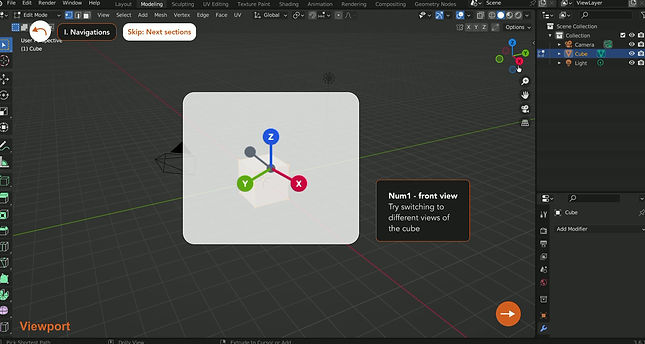
Users find the animated demonstration of the features useful but preferred the challenge orientations more.
A. Without Center animation

Users appreciated the hotkey documentations but preferred a more subtle visual of the hotkey
B. With center animation


USER TESTING II
Hi-fidelity designs based on the results of user-testing


Added foldable objectives tab
Moved the button to the side


Step by step instructions
Next step moved to a foldable tab


-
Aesthetics that matches blender
-
Instructions + color-map in a single panel
-
Feature-based to step-by-step instructions
FINAL OUTPUT
Three-part Onboarding Process
1
Rich tool tips - hover to see the feature


2
Feature map & Hot key documentations


3
Short challenges to get hands-on with the features

REFLECTIONS
Learning
Onboarding is not simplification
This project taught me that Blender does not need to become less complex for beginners. It needs a clearer entry point. The goal was to guide users into the software’s existing power, not remove the depth that makes it useful.
Design Shift
Users prefer to learn by making
Our early design focused on explaining tools, but testing showed that users felt more engaged when they were working toward a visible result. This shifted our tutorial from feature-based instruction to short, goal-based challenges.
Areas of Growth
Giving guidance without taking over
The hardest balance was deciding how much help to show at once. Center-screen popups felt intrusive, but no guidance left users lost. Moving support into foldable panels helped the interface feel lighter while keeping help close by.